Đăng ký
Ting ngay
Ting ngay
Sử dụng điện thoại để quét mã QR hoặc nhấn tải app để tải ứng dụng Ting


In 2019 Rice was approached by Mai Anh to create a brand identity for a product in development by her company Vidiva. Vidiva creates practical Fin-tech brands for the Vietnamese market with an aim to improve people’s relationship to personal finance, serve the needs of local businesses, and make a positive impact on society through useful and well designed products. Vidiva’s first brand, a simple and easy to use peer to peer payment app was in the works when Mai Anh approached Rice. This is a peek into the process that shaped this new brand.
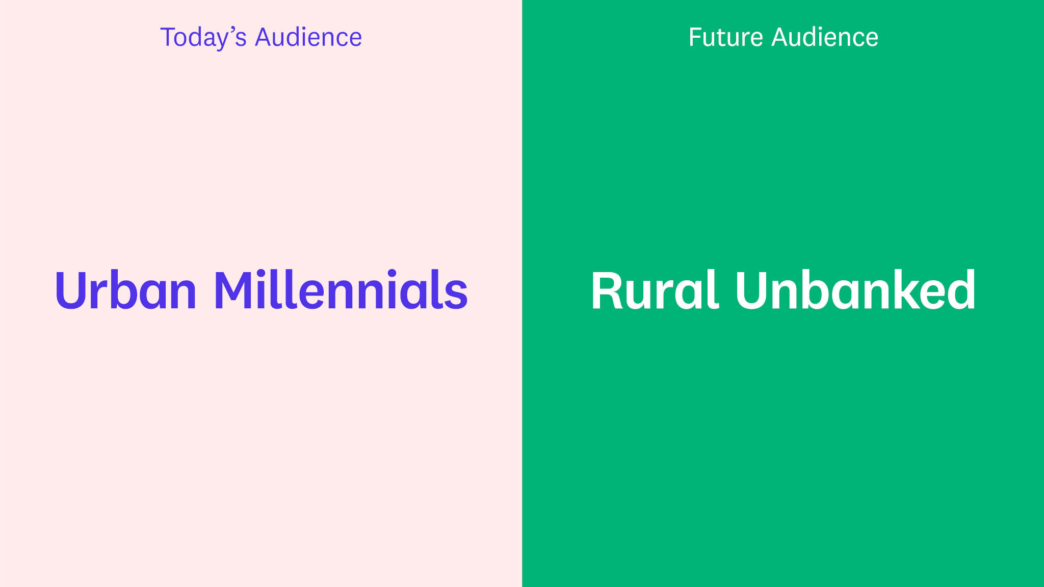
In the first stage of any branding project it is crucial that a team develops a mindset of curiosity and open minded discovery. At Rice we believe if we are to create truly meaningful and impactful work, we need to know well the company who hired us. It is our aim to gather as much knowledge and understanding as we can, from the get go. We typically start our research stage with interviews of key team members, with site visits, or with workshops designed to spark a creative mindset amongst the broader team. We make an effort to gain insights on many levels, from company culture, to product, to dreams and aspirations. We ask ourselves all sorts of questions. What is this brand really all about? How does it touch people's lives? What is it trying to achieve? What about this company or product is worth believing in? For the project with Vidiva, we made a few valuable discoveries during this phase (opportunities and well as challenges) that helped us focus our work. For example, we discovered that while Vidiva in the short term hoped to reach young urban professionals in big cities like Ho Chi Minh City with its peer-to-peer payment product, in the long run it hoped to reach the rural unbanked. Two different audiences, of two different socio-economic groups, who would interact with the product in two different ways. Identifying this challenge helped us to focus our strategy.
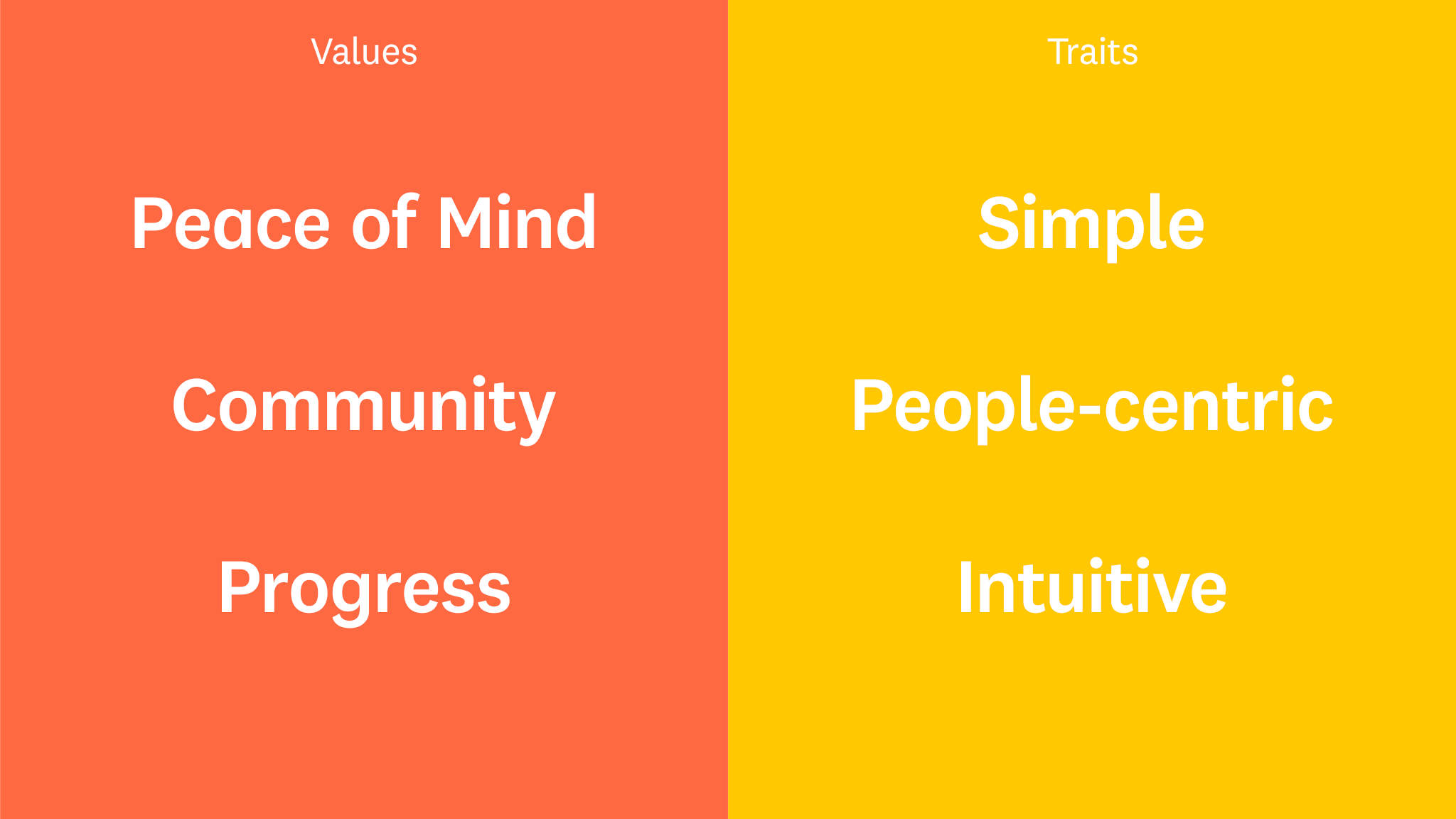
The strategy phase is when we start to define a brand and what it is all about. Based on what we learned in the research phase we can start to identify and solidify important aspects of the brand. What does a brand believe in? What does it care about? What is its purpose in the world? For whom does it exist? It's an exciting process of discovery, where the new brand starts to take shape and have form. For Vidiva's new brand this process allowed us to define some traits and values that had a significant impact on the way that the brand identity was built, from a visual perspective. The traits were SIMPLE, INTUITIVE & HUMAN CENTRIC. The values were PEACE OF MIND, COMMUNITY and PROGRESS. We came to these traits and values through the research but also through consideration of the 2 distinct target audience groups (young urbanites and the rural unbanked). Putting the focus on these traits/values helped us to bridge the gap between the two groups, and directly impacted the way we approached design.
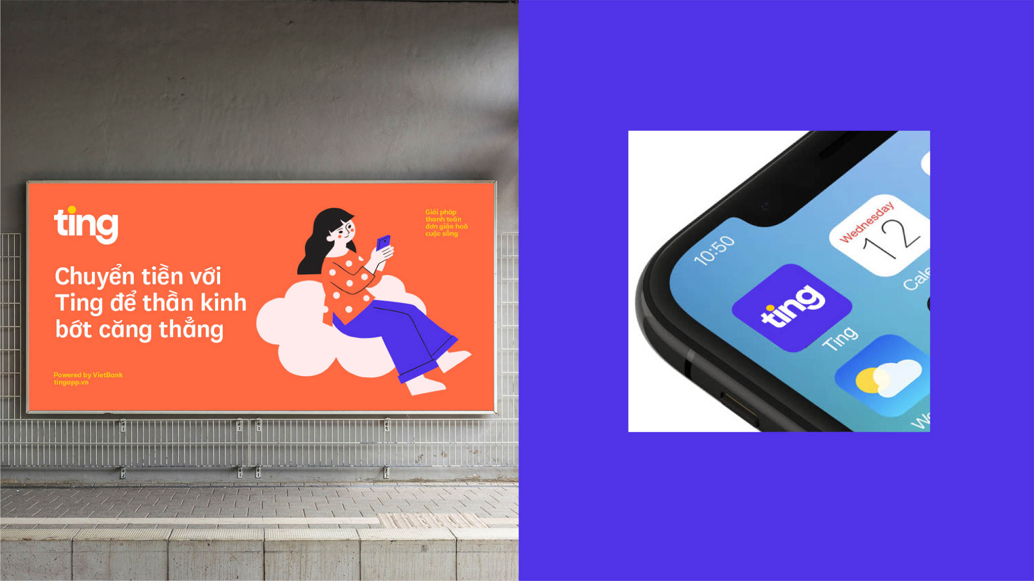
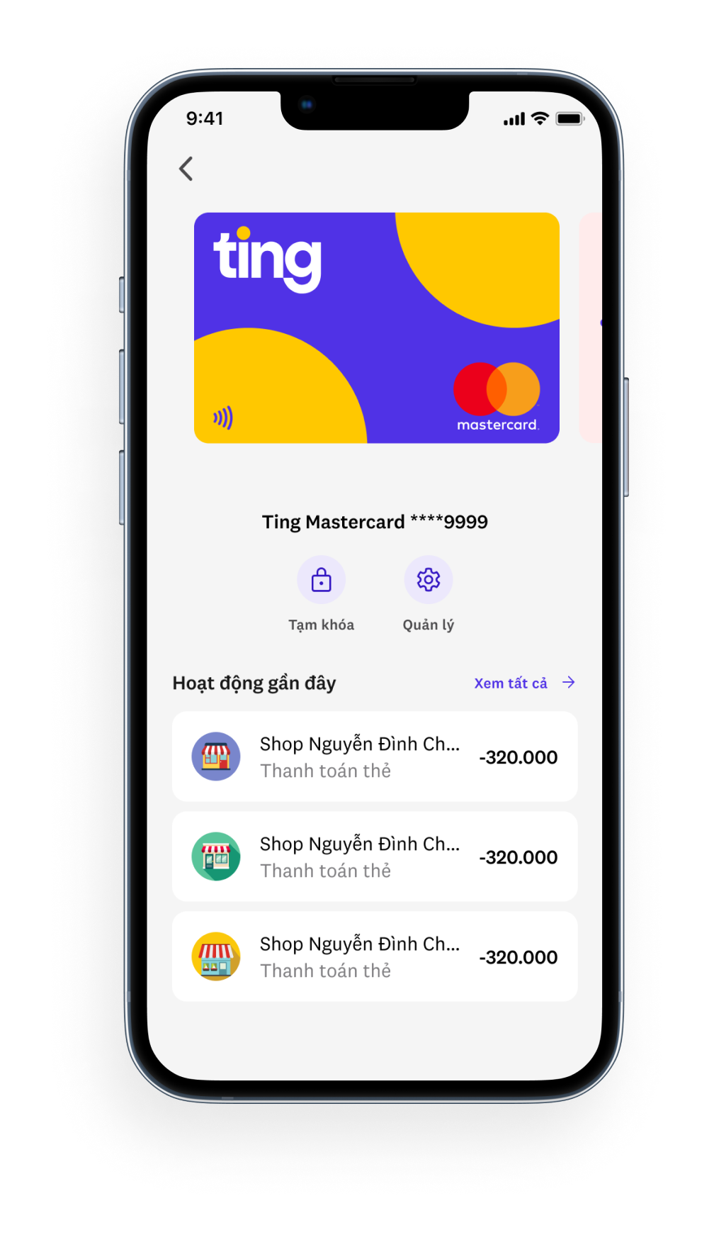
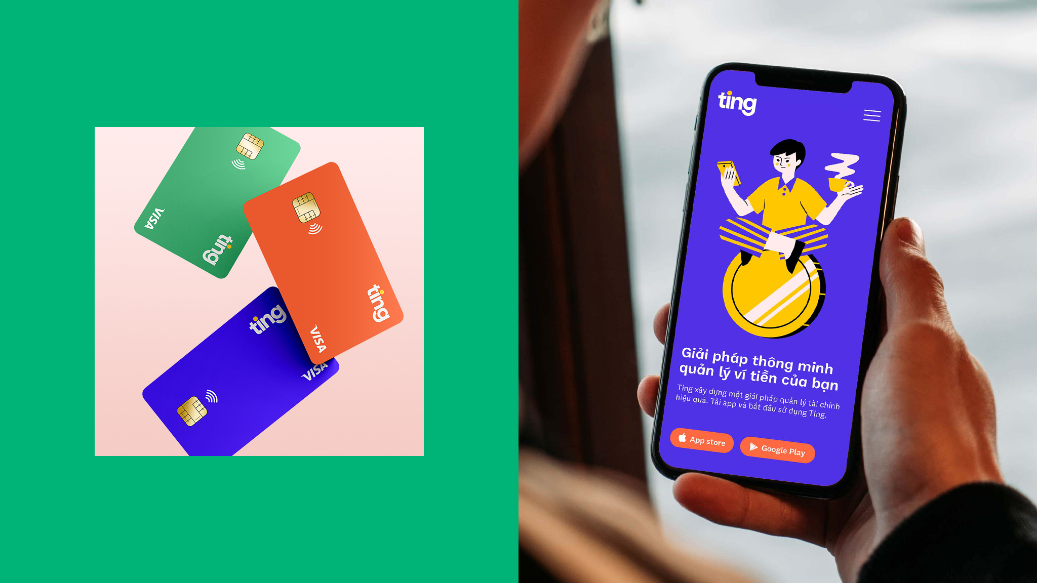
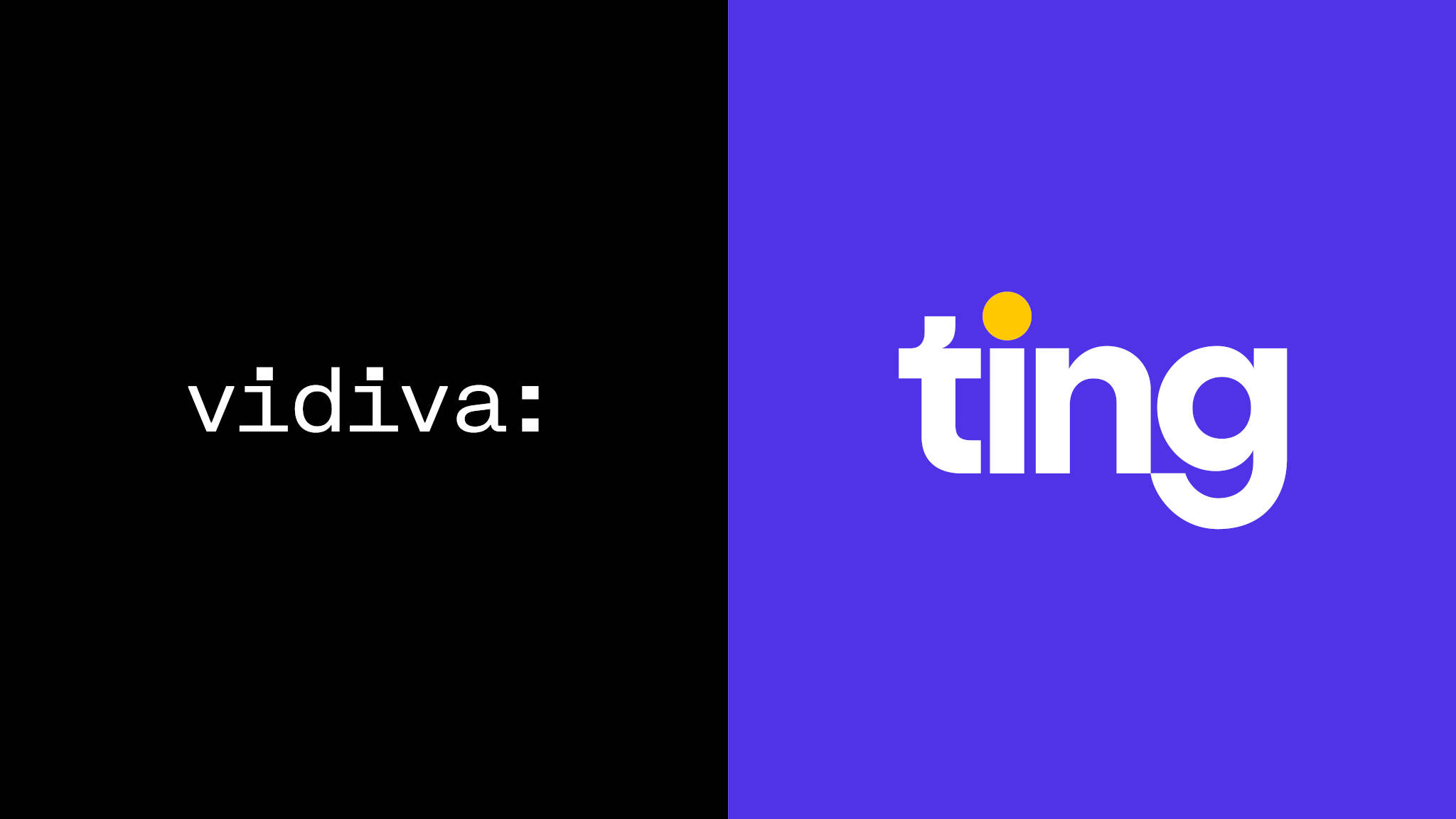
We started our creative work with the brand name. We decided a name that was short, easy to pronounce and remember, would be the most appropriate for the brand. After an in depth naming process, we landed on Ting. Ting is inspired by the sound a coin makes when it falls into your piggy bank. It is catchy, and relates to the purpose of the product which is the exchange of currency. Because Ting is based on the sound of a coin, we decided to use a coin as the main symbolic element of the Ting logo. Simplified into a golden yellow circle, the Ting coin dots the "i" in Ting. The golden yellow circle was eventually utilized in other areas of the identity as a simple and branded device.
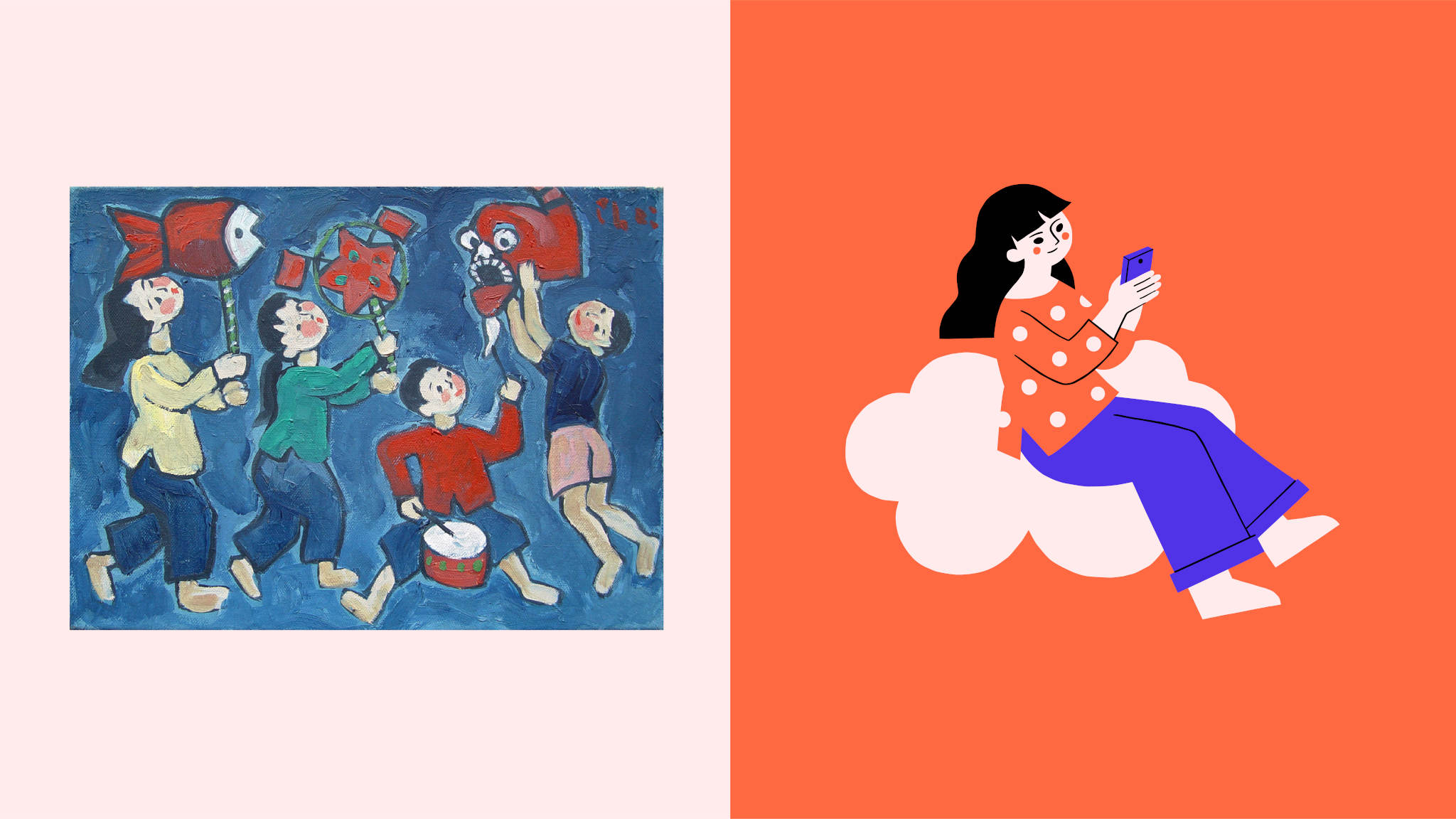
As we furthered our design process, we continued to refer to our research and strategy as a way to focus our exploration. Pondering the human-centric and community focused nature of Ting, the team began to explore meaningful ways for our concept to come to life. One point of inspiration came from Vietnamese folk traditions. In particular, illustrated characters that can be found in certain types of folk art throughout Vietnam. These characters are simply drawn, colorful, very charming, and represent the community spirit of the Vietnamese culture. We decided to develop a set of illustrated characters for Ting, based on these folk drawings. With the brand’s first target audience in mind, we developed a set of illustrated young adults, who were the modern versions of these traditional folk characters. The set could be expanded in time to include people of all ages and backgrounds, in order to reflect Ting's diversified audience base. The folk drawings not only informed the illustration style of Ting, but also the bright and optimistic color palette.
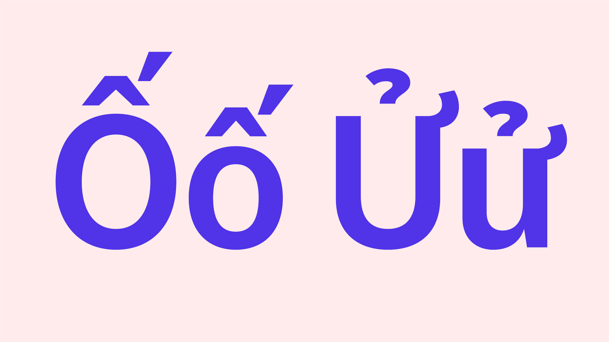
Typography is always an important building block to any brand. For Ting we selected a range of typefaces that we felt communicated the right spirit. At the same time we selected fonts that would work well in digital environments such as a website or the Ting App. In order to ensure that the fonts functioned as best as they could for Ting, we worked together with a type foundry and an independent type designer to create custom diacritics (accent marks) for Vietnamese language usage.
The culmination of the whole creative process is the brand guidelines. In the brand guidelines you can find all of the learnings, discoveries and designs that were made along the way, organized as a manual. Brand guidelines are sometimes referred to as "brand bibles". While I don't see them as sacred text, Brand Guidelines are a place where you can find ideas, beliefs, answers, inspiration, and so much more. In the brand guidelines you can feel the influence of a brand’s past as well as a new vision of its future. Once we established our brand guidelines, we were able to work together with the Ting team to design the Ting App. But that is another project and another story.
Truly, this only scratches the surface of what it takes to create a brand like Ting. In actuality the brand is still being made and will continue to be made well into the future. A brand is not static, it’s a living thing, and it is formed through time. It is formed by a team of people who put their passion and energy into it. It is formed by the promises that the brand makes to their customers, and keeps. It is also formed by the public and those who follow the brand. I wish the Ting team and the Vidiva team the best of luck and look forward to more collaborations in the future.